A Practical Review Checklist for AI Image Generators Before You Share the ResultAI image generators are easy to start with and surprisingly easy to over-trust. The picture that looks finished in the preview can still carry resolution limits, licensing gaps, or small artifacts that only show up after you post it. This short checklist is written for reviewers and creators who need a repeatable way to decide whether an AI-generated image is actually ready to ship.
1. Confirm the prompt actually matched the image
Before anything else, read the image against your own prompt. The fastest failure mode is a confident-looking result that quietly dropped a constraint: a missing object, a wrong count, or a brand color that drifted. Treat the prompt as a spec, not a wish. When the output misses part of the spec, regenerate with the constraint restated rather than editing around it.
2. Check the real output resolution and format
Many tools cap the resolution or the aspect ratios they will return, and some downscale exports silently. Verify the delivered file dimensions before you place it into a layout. For example, tools such as GPT Image 2.5 describe their supported outputs on the product page, and you should confirm the exported size matches what your downstream design or print step expects.
3. Review licensing and allowed use
Generated images are not automatically safe for every use. Check whether commercial use is allowed, whether attribution is required, and whether the model imposes restrictions on trademarks, recognizable people, or public figures. According to the product page, usage terms should be confirmed there before you rely on an image for client or paid work.
4. Look for artifacts at 100 percent
Thumbnails hide problems. Open the exported file at full size and scan edges, text, hands, and repeated patterns. Watermark-like smudges, warped lettering, and melted backgrounds are common. A quick artifact pass saves you from publishing something that looks broken on a large screen.
5. Compare a few variations, not one
A single result is a poor basis for a decision. Generate a small set of variations, then pick the one that survives review rather than the first acceptable frame. This also gives stakeholders a concrete choice instead of an open-ended ask.
6. Plan for platform compression
Social platforms and messengers re-encode images. Export at a quality that survives compression, and avoid tiny text that becomes unreadable after upload. If a preview looks crisp but the posted version looks soft, the export settings are usually the cause.
7. Keep a human review step
AI image review works best as a human-in-the-loop step, not a final authority. Use the model to produce candidates, then apply judgment on brand fit, safety, and accuracy. The reviewer stays responsible for what gets published, and that accountability is what makes the output trustworthy.
Used this way, a tool like GPT Image 2.5 becomes a faster drafting partner rather than a black box. Define the spec, generate a small set, review at full resolution, confirm the terms, and only then ship. The checklist is dull on purpose: the goal is a consistent bar, not a lucky hit. A Practical Review Checklist for AI Image Generators Before You Share the ResultAI image generators are easy to start with and surprisingly easy to over-trust. The picture that looks finished in the preview can still carry resolution limits, licensing gaps, or small artifacts that only show up after you post it. This short checklist is written for reviewers and creators who need a repeatable way to decide whether an AI-generated image is actually ready to ship.
1. Confirm the prompt actually matched the image
Before anything else, read the image against your own prompt. The fastest failure mode is a confident-looking result that quietly dropped a constraint: a missing object, a wrong count, or a brand color that drifted. Treat the prompt as a spec, not a wish. When the output misses part of the spec, regenerate with the constraint restated rather than editing around it.
2. Check the real output resolution and format
Many tools cap the resolution or the aspect ratios they will return, and some downscale exports silently. Verify the delivered file dimensions before you place it into a layout. For example, tools such as GPT Image 2.5 describe their supported outputs on the product page, and you should confirm the exported size matches what your downstream design or print step expects.
3. Review licensing and allowed use
Generated images are not automatically safe for every use. Check whether commercial use is allowed, whether attribution is required, and whether the model imposes restrictions on trademarks, recognizable people, or public figures. According to the product page, usage terms should be confirmed there before you rely on an image for client or paid work.
4. Look for artifacts at 100 percent
Thumbnails hide problems. Open the exported file at full size and scan edges, text, hands, and repeated patterns. Watermark-like smudges, warped lettering, and melted backgrounds are common. A quick artifact pass saves you from publishing something that looks broken on a large screen.
5. Compare a few variations, not one
A single result is a poor basis for a decision. Generate a small set of variations, then pick the one that survives review rather than the first acceptable frame. This also gives stakeholders a concrete choice instead of an open-ended ask.
6. Plan for platform compression
Social platforms and messengers re-encode images. Export at a quality that survives compression, and avoid tiny text that becomes unreadable after upload. If a preview looks crisp but the posted version looks soft, the export settings are usually the cause.
7. Keep a human review step
AI image review works best as a human-in-the-loop step, not a final authority. Use the model to produce candidates, then apply judgment on brand fit, safety, and accuracy. The reviewer stays responsible for what gets published, and that accountability is what makes the output trustworthy.
Used this way, a tool like GPT Image 2.5 becomes a faster drafting partner rather than a black box. Define the spec, generate a small set, review at full resolution, confirm the terms, and only then ship. The checklist is dull on purpose: the goal is a consistent bar, not a lucky hit. A review-first checklist for AI video upscalersWhy teams reach for an AI video upscaler
When a source clip is too soft for a landing page, a slide, or a social cut, upscaling is the obvious next step. AI video upscalers promise to recover detail and push resolution toward 4K without a reshoot. But an upscaled clip is only useful if it survives a real review. This post is a practical checklist for evaluating any AI upscaler, using a browser-based option such as Video2x as a concrete example, without overclaiming what the model does.
What upscaling actually changes
Upscaling increases pixel dimensions. With an AI model, it also attempts to reconstruct plausible high-frequency detail: edges, texture, and small type that the source lacks. It does not recover information that was never captured. The realistic goal is a cleaner, larger, and more presentable frame, not a true 4K master. Keep the original as the source of truth.
When upscaling is worth it
Good fits include old product demos, screen recordings, phone footage, and archival clips that need a second life. Poor fits include heavily compressed video and motion-blurred scenes, where reconstruction tends to invent detail that reads as artifacts. Decide by comparing at the same display size, not by trusting a resolution label.
A review-first workflow
Define the target: output resolution, aspect ratio, and where the clip will be shown.
Pick one short segment of five to fifteen seconds as a review sample.
Run the upscaler and export a frame sheet, every Nth frame, for side-by-side review.
Review for edge clarity, texture realism, label legibility, and temporal stability across frames.
Gate on a human pass before the clip is published anywhere.
Browser-based tools and a low-commitment first pass
A browser-based upscaler such as Video2x lets a team run a sample without installing desktop software or uploading large files to an unknown server. Video2x positions itself as a free, browser-based AI video upscaler with a credit-based free tier, so a first review sample can be produced at no cost. Keep the claim conservative: verify the output on your own footage before relying on it for a launch asset.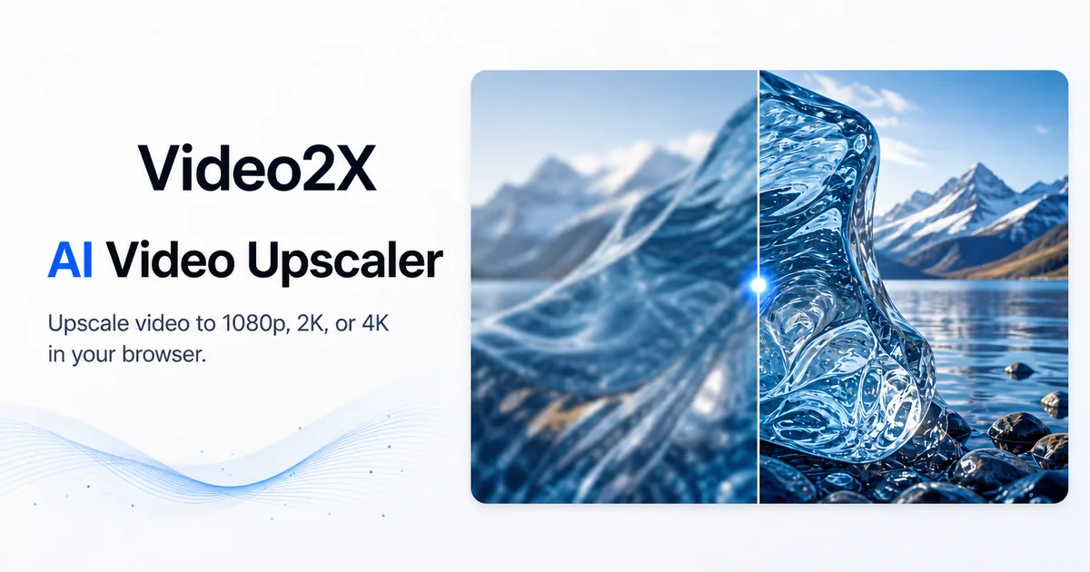
A review-first checklist for AI video upscalersWhy teams reach for an AI video upscaler
When a source clip is too soft for a landing page, a slide, or a social cut, upscaling is the obvious next step. AI video upscalers promise to recover detail and push resolution toward 4K without a reshoot. But an upscaled clip is only useful if it survives a real review. This post is a practical checklist for evaluating any AI upscaler, using a browser-based option such as Video2x as a concrete example, without overclaiming what the model does.
What upscaling actually changes
Upscaling increases pixel dimensions. With an AI model, it also attempts to reconstruct plausible high-frequency detail: edges, texture, and small type that the source lacks. It does not recover information that was never captured. The realistic goal is a cleaner, larger, and more presentable frame, not a true 4K master. Keep the original as the source of truth.
When upscaling is worth it
Good fits include old product demos, screen recordings, phone footage, and archival clips that need a second life. Poor fits include heavily compressed video and motion-blurred scenes, where reconstruction tends to invent detail that reads as artifacts. Decide by comparing at the same display size, not by trusting a resolution label.
A review-first workflow
Define the target: output resolution, aspect ratio, and where the clip will be shown.
Pick one short segment of five to fifteen seconds as a review sample.
Run the upscaler and export a frame sheet, every Nth frame, for side-by-side review.
Review for edge clarity, texture realism, label legibility, and temporal stability across frames.
Gate on a human pass before the clip is published anywhere.
Browser-based tools and a low-commitment first pass
A browser-based upscaler such as Video2x lets a team run a sample without installing desktop software or uploading large files to an unknown server. Video2x positions itself as a free, browser-based AI video upscaler with a credit-based free tier, so a first review sample can be produced at no cost. Keep the claim conservative: verify the output on your own footage before relying on it for a launch asset. Four decision criteria for visual briefs that need clear text and flexible sizesWhen a visual brief moves from 'we need a hero image' to 'we need a set of options with readable text at 4:5 and 1:1,' the bottleneck is rarely the idea. It's the gap between the brief and a reviewable asset. Designers and operators often jump between sketching, stock search, and manual layout, which makes the review step feel slow and subjective.A more useful approach is to define decision criteria before evaluating any image generation path. Those criteria should reflect what the brief actually asks for, not what a tool happens to advertise.Decision criteria before committing to an image pipelineFor briefs that require realistic images with embedded text, four criteria can separate a useful option from a novelty.Text clarity in the image. If the brief requires a label, badge, or caption inside the visual, low text fidelity creates immediate rejection in review. Ask whether the tool can render short, legible copy without manual touch-ups.Output size flexibility. A concept that only works at one aspect ratio often fails the moment a landing page, social card, or presentation slide needs a different frame. The tool should allow the same direction to be explored in multiple sizes without losing composition.Editability without starting over. After the first review, teams rarely keep the image unchanged. A useful tool lets you adjust a detail, swap an element, or extend a background while preserving the rest.Speed to multiple directions. The point is not a single perfect image, but a small set of reviewable directions that can be compared against the brief.These criteria are not product features; they are decisions you make about the workflow. They also apply whether you use a paid model, an open-source tool, or a manual composite.Using the criteria in a short review loopConsider a simple use case: a marketing team has a brief for a product launch hero that must include a short product name in small text, work at both 1:1 and 16:9, and feel grounded rather than illustrated. Instead of a designer producing one polished mockup, the team runs a short loop:Draft the brief with the exact text, sizes, and style reference.Generate a first set using any tool that claims to handle text and aspect ratios.Review the outputs against the four criteria, not just visual appeal.Pick the closest direction and request a targeted edit, such as moving the text or changing the background, rather than a full regeneration.In this loop, the tool is only a step between the brief and the review. One product page that describes this kind of capability is Qwen Image 3.0, which lists realistic images, clear text, flexible sizes, and image editing as core parts of its preview. It may be worth trying when the brief requires several directions with text and size constraints, but the decision should still follow the criteria, not the product claim.What to do nextAfter testing a few directions, write down which criteria caused the most rework. If text clarity is the recurring failure, prioritize that in the next tool or prompt. If size flexibility is fine but editing is slow, focus on tools that preserve changes. Keep the brief as the source of truth, and use any image generator as a way to make the review step more concrete.Return to the brief before the next asset request. The most useful tool is the one that reduces the gap between a written brief and a set of options you can review against clear criteria.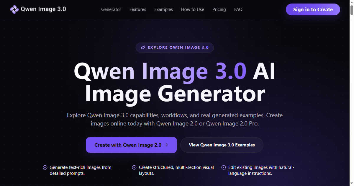
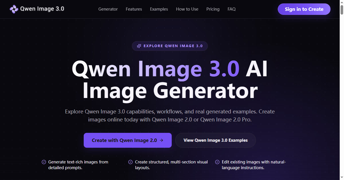
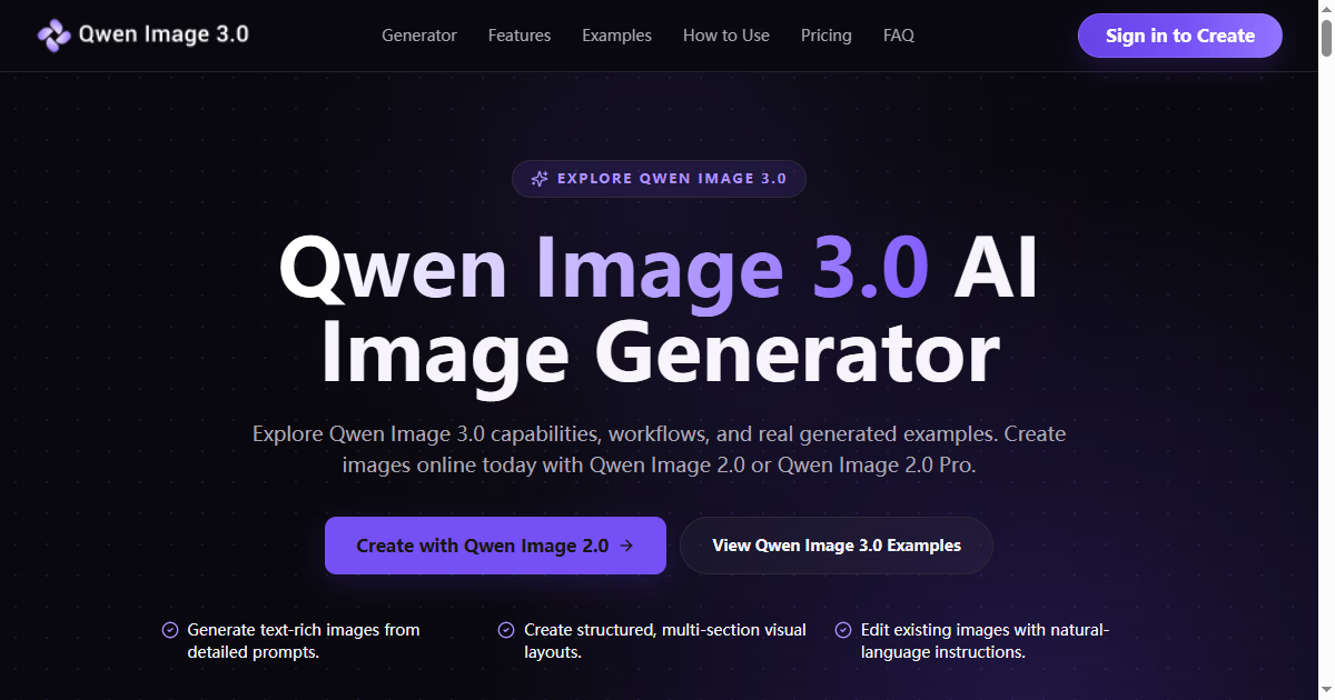
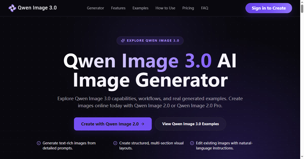
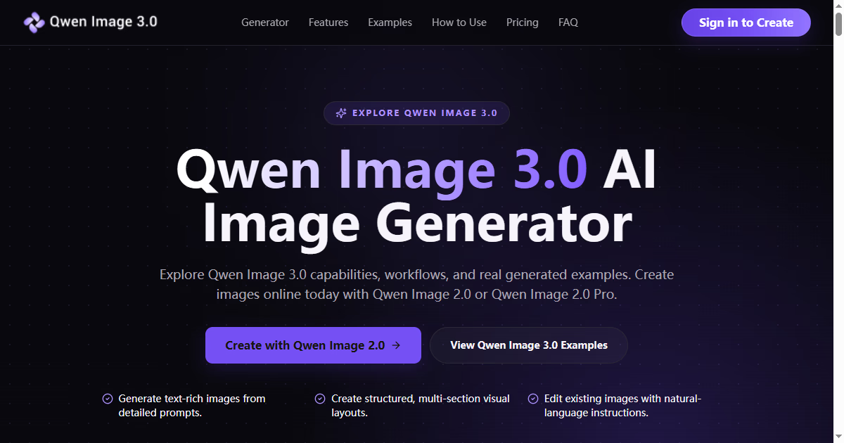
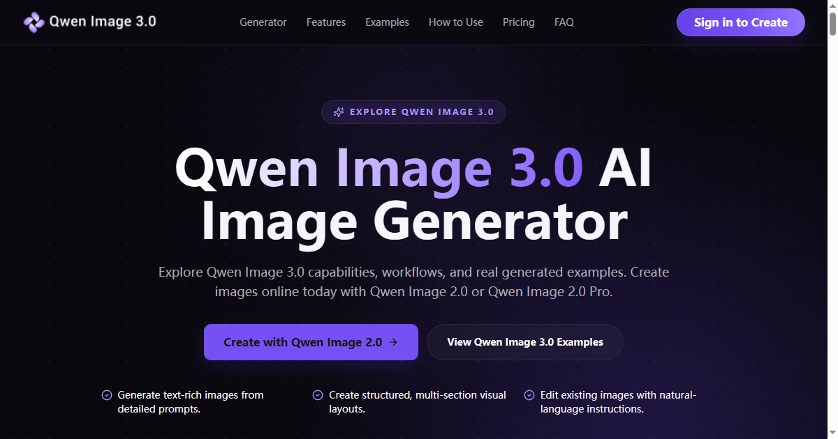
Four decision criteria for visual briefs that need clear text and flexible sizesWhen a visual brief moves from 'we need a hero image' to 'we need a set of options with readable text at 4:5 and 1:1,' the bottleneck is rarely the idea. It's the gap between the brief and a reviewable asset. Designers and operators often jump between sketching, stock search, and manual layout, which makes the review step feel slow and subjective.A more useful approach is to define decision criteria before evaluating any image generation path. Those criteria should reflect what the brief actually asks for, not what a tool happens to advertise.Decision criteria before committing to an image pipelineFor briefs that require realistic images with embedded text, four criteria can separate a useful option from a novelty.Text clarity in the image. If the brief requires a label, badge, or caption inside the visual, low text fidelity creates immediate rejection in review. Ask whether the tool can render short, legible copy without manual touch-ups.Output size flexibility. A concept that only works at one aspect ratio often fails the moment a landing page, social card, or presentation slide needs a different frame. The tool should allow the same direction to be explored in multiple sizes without losing composition.Editability without starting over. After the first review, teams rarely keep the image unchanged. A useful tool lets you adjust a detail, swap an element, or extend a background while preserving the rest.Speed to multiple directions. The point is not a single perfect image, but a small set of reviewable directions that can be compared against the brief.These criteria are not product features; they are decisions you make about the workflow. They also apply whether you use a paid model, an open-source tool, or a manual composite.Using the criteria in a short review loopConsider a simple use case: a marketing team has a brief for a product launch hero that must include a short product name in small text, work at both 1:1 and 16:9, and feel grounded rather than illustrated. Instead of a designer producing one polished mockup, the team runs a short loop:Draft the brief with the exact text, sizes, and style reference.Generate a first set using any tool that claims to handle text and aspect ratios.Review the outputs against the four criteria, not just visual appeal.Pick the closest direction and request a targeted edit, such as moving the text or changing the background, rather than a full regeneration.In this loop, the tool is only a step between the brief and the review. One product page that describes this kind of capability is Qwen Image 3.0, which lists realistic images, clear text, flexible sizes, and image editing as core parts of its preview. It may be worth trying when the brief requires several directions with text and size constraints, but the decision should still follow the criteria, not the product claim.What to do nextAfter testing a few directions, write down which criteria caused the most rework. If text clarity is the recurring failure, prioritize that in the next tool or prompt. If size flexibility is fine but editing is slow, focus on tools that preserve changes. Keep the brief as the source of truth, and use any image generator as a way to make the review step more concrete.Return to the brief before the next asset request. The most useful tool is the one that reduces the gap between a written brief and a set of options you can review against clear criteria. HelloThis is your page on Whilst.
Write when you feel like it.
You can add text, images, and links.
This post is yours to edit or delete. HelloThis is your page on Whilst.
Write when you feel like it.
You can add text, images, and links.
This post is yours to edit or delete.